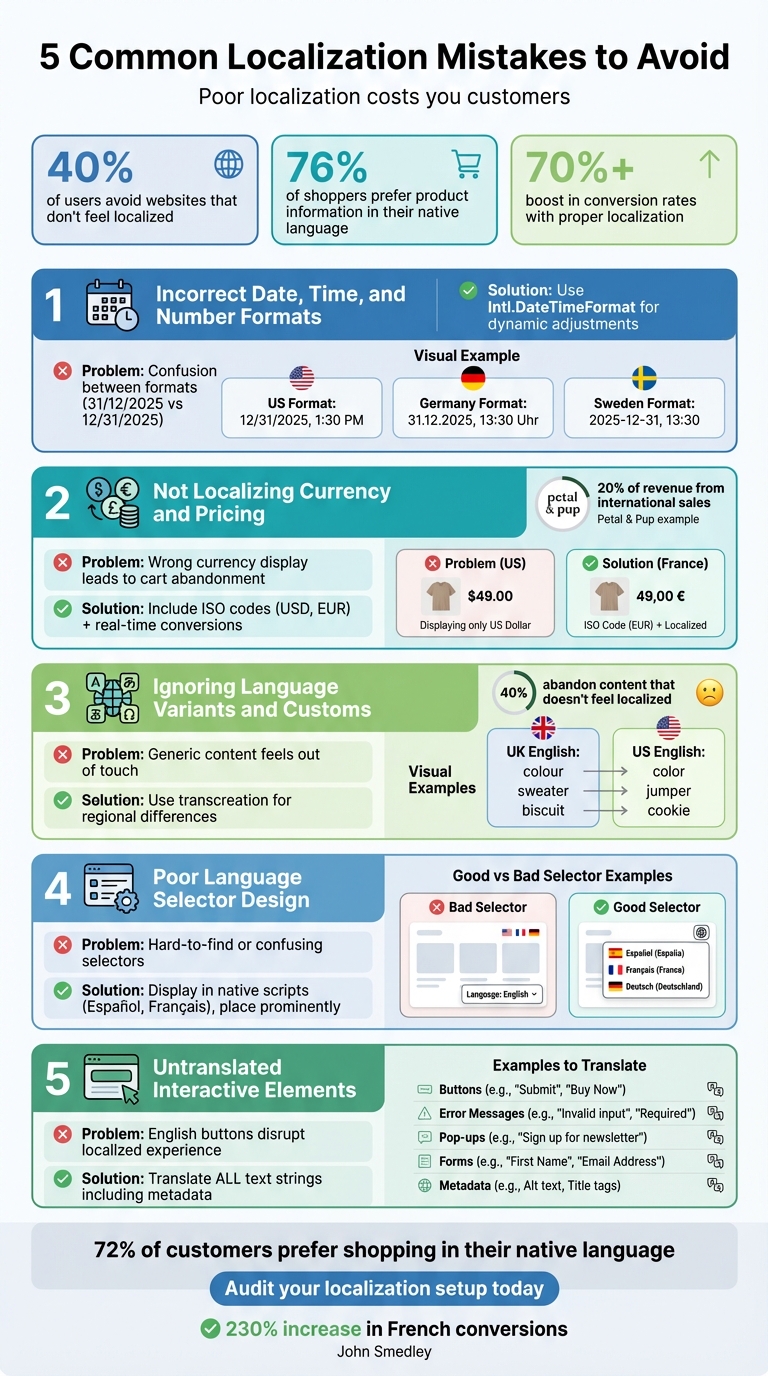
Common Localization Mistakes to Avoid
Localization can make or break your global business success. Poor localization frustrates users, erodes trust, and leads to lost sales. For instance, 40% of users avoid websites that don’t feel localized, and 76% of shoppers prefer product information in their native language. On the flip side, proper localization can boost conversion rates by over 70%.
Here are five common localization mistakes that hurt conversions and how to fix them:
-
Incorrect Date, Time, and Number Formats
- Misformatted dates (e.g., "31/12/2025" vs. "12/31/2025") create confusion.
- Use tools like
Intl.DateTimeFormatto dynamically adjust formats for each region.
-
Not Localizing Currency and Pricing
- Displaying prices in the wrong currency or format (e.g., "$49.00" vs. "49,00 €") leads to abandoned carts.
- Include ISO currency codes (e.g., USD, EUR) and real-time conversions to avoid surprises.
-
Ignoring Language Variants and Customs
- Tailor content for regional differences (e.g., "color" in the US vs. "colour" in the UK).
- Use transcreation to align language and tone with local expectations.
-
Poor Language Selector Design
- Hard-to-find or confusing selectors drive users away.
- Display language options in native scripts (e.g., Español, Français) and place the selector prominently.
-
Untranslated Interactive Elements
- Buttons, error messages, and pop-ups left in English disrupt the experience.
- Translate all text strings, including metadata and dynamic content, for a cohesive experience.
Quick Tip: Tools like Heylingo simplify localization by automatically adjusting formats, translating content, and ensuring consistency across your site. Proper localization builds trust, improves user experience, and drives global growth.
5 Common Localization Mistakes That Hurt Conversions and How to Fix Them
Mistake 1: Using the Wrong Date, Time, and Number Formats
Why Universal Formats Fall Short
Imagine a U.S. shopper encountering "31/12/2025" on your checkout page. Would they interpret it as December 31 or March 12? That brief moment of uncertainty can derail a purchase. These small but critical formatting mismatches suggest your site isn’t designed with international users in mind. As Simona Rahmanova from Localazy explains:
"What feels familiar also feels reliable to customers."
When your dates, numbers, or currency symbols deviate from local norms, users may question your professionalism - or even your trustworthiness. A staggering 40% of users will avoid buying from websites that fail to localize properly.
Formatting conventions vary widely depending on the region. In the U.S., dates follow the MM/DD/YYYY format, commas separate thousands (e.g., 12/31/2025, 200,000), and the dollar sign appears before the amount (e.g., $49.00). In Germany, it’s DD.MM.YYYY for dates, periods for thousands (e.g., 31.12.2025, 200.000), and the euro symbol comes after the amount with commas for decimals (e.g., 49,00 €). Sweden takes yet another approach, using YYYY-MM-DD for dates and spaces for thousands (e.g., 2025-12-31, 200 000). Even capitalization rules differ - months are capitalized in English but often lowercase in languages like French and Swedish.
Adapting to Local Formatting
Hard-coding formats into your site can lead to errors and inconsistencies. Instead, rely on internationalization (i18n) frameworks that dynamically adjust formats based on the user’s locale. Tools like Intl.DateTimeFormat and Intl.NumberFormat are designed to handle these adjustments, but they need to be implemented consistently across your entire platform.
Platforms like Heylingo simplify this process by detecting a visitor’s region and applying the correct formatting automatically. For instance, a German customer visiting your site will see "1.234,56 €" instead of "$1,234.56." This ensures dates, number separators, and currency symbols are displayed in the format they expect - from product listings to the final checkout page. Following a website translation checklist can help ensure these technical details aren't overlooked.
Up next, we’ll explore the challenges of currency localization and how to address them effectively.
sbb-itb-8482ffa
Top 3 Website Localisation Mistakes to Avoid | Masqar Translation Services
Mistake 2: Not Localizing Currency and Pricing
Adjusting formats for clarity is a good start, but displaying localized pricing is what builds trust throughout the buying process.
Common Currency Localization Problems
Showing prices in a currency that doesn’t match the customer’s location can cause instant confusion. Many shoppers assume prices are in their local currency until they reach checkout, only to discover unexpected conversion fees. This surprise often leads to abandoned carts.
And it’s not just about using the right symbol. More than 20 countries use the dollar sign, making it tricky to know whether prices are in USD, CAD, NZD, or AUD unless the correct ISO 4217 codes (like "USD" or "CAD") are clearly displayed.
Derek Gleason from Shopify highlights this perfectly:
"Localizing is not only translation to different languages but also semantics like spelling, idioms, date formatting, currency symbols - plus design that considers the cultural context. These may sound like little details, but this is what makes someone feel the experience was made for them. When those little details are wrong, the shopper notices."
Here’s a real-world example: In 2024, Australian fashion retailer Petal & Pup tailored content and currency for shoppers in New Zealand, the United Arab Emirates, and Canada. This move helped international sales grow to 20% of their total revenue.
How to Set Up Localized Pricing
Accurate currency handling goes hand-in-hand with format localization. Real-time currency conversion can simplify things by automatically showing prices in the visitor’s local currency. This transparency helps eliminate one of the biggest reasons for cart abandonment: unclear or hidden extra costs.
To avoid confusion, follow ISO 4217 standards, which use three-letter codes (like USD, EUR, or GBP) alongside currency symbols. Pay attention to regional formatting too - prices in the U.S. might look like $49.00, while in France, they’d appear as 49,00 €. Similarly, number formatting varies: the U.S. uses commas for thousands and periods for decimals, while Europe does the opposite.
Platforms like Heylingo make this process seamless by detecting a visitor’s location and applying the correct currency format across your site, from product pages to checkout. For example, a U.S. visitor would see $1,234.56, while someone in Germany would see 1.234,56 €. This level of localization can boost conversion rates by up to 40%. Personalized ecommerce experiences, in general, have been shown to increase conversions by 10–15% and improve customer satisfaction by 20%.
With international shoppers projected to spend $8 trillion annually by 2028, nailing currency localization isn’t just a nice-to-have - it’s essential for tapping into global markets.
Mistake 3: Ignoring Language Variants and Local Customs
After addressing the importance of localizing dates, currency, and pricing, it’s equally crucial to focus on language variants and regional customs. Overlooking these subtle differences can negatively affect how users connect with your content.
Why Local Customs Matter
The differences between US and UK English extend far beyond spelling quirks like "color" versus "colour." They include distinct vocabulary choices (like "sweater" vs. "jumper" or "apartment" vs. "flat"), date formats (e.g., "November 2, 2025" vs. "2 November 2025"), and unique regional terms such as "fortnight" or "Boxing Day", which may not resonate with American audiences. Failing to get these details right can make your content feel generic or out of touch.
As Derek Gleason points out:
"You can publish in the same language for the US, UK, Australia, Canada, and New Zealand, but those semantics will be different."
The consequences are real. Research shows that 40% of users will abandon content that doesn’t feel localized. And localization isn’t just about translating words - it’s about ensuring your message aligns with the cultural and linguistic expectations of your audience.
Even visual elements can carry different meanings. Colors that represent celebration in one region might signal caution in another. Imagery, symbols, and even the tone of your writing need to align with local preferences to truly connect with your audience.
How to Adapt Content for Different Regions
Start with a linguistic audit to identify idioms, vocabulary, and formatting preferences specific to each target market. For high-stakes content like marketing campaigns, consider transcreation - a process that goes beyond literal translation to reimagine your message while maintaining your brand’s voice and aligning with local expectations.
Don’t forget about search behavior. Localizing keywords to reflect how people search in different regions ensures your content appears in local search results.
Tools like Heylingo make this process seamless by automatically detecting a visitor’s location and applying the appropriate language variant. For example, someone in London would see "colour" and "£200", while a visitor in New York would see "color" and "$200.00." This automation eliminates manual adjustments and provides a fully localized experience. For businesses targeting multiple English-speaking regions, this level of precision can significantly boost conversion rates and foster trust.
Mistake 4: Bad Language Selector Design
Even the most precise localization efforts can fall flat if users struggle to switch languages on your site. When the language selector is hard to find or confusing to use, many visitors will simply leave. Here's a key statistic: 76% of consumers prefer to shop on websites in their native language. So, making language options accessible isn't just a nice-to-have - it's essential for keeping customers.
What Goes Wrong with Language Selectors
A common pitfall is listing language options only in English. For instance, showing "Spanish" instead of "Español" or "Chinese" instead of "中文" can alienate users who might not recognize their language in English. As Avantpage explains:
"Listing language options solely in English defeats localization since the user won't always be able to read their language name in English."
Another issue is hiding the language selector in hard-to-find places like the footer or buried within menus. Users expect these options to be easily visible - often at the top of the page. Making them hunt for this feature can lead to frustration and, ultimately, site abandonment.
Automatic geolocation redirects can also backfire, especially when there’s no manual override. Travelers, VPN users, or bilingual visitors may get stuck on the wrong language version with no way to fix it.
Finally, relying on flags to represent languages can cause confusion. For example, using a Spanish flag might not resonate with users in Mexico or Argentina. After all, flags represent countries, not languages.
How to Design Better Language Selectors
To create a better user experience, display language names in their native script - like Français, Deutsch, or 日本語 - so users can quickly identify their option. Place the language selector in a prominent spot, such as the top right corner on desktop or within the main navigation menu on mobile, where it's easy to locate.
Adding a globe icon can serve as a universal visual cue for language options. Always include a manual override feature to give users control, preventing the frustration of being locked into the wrong language version.
Another helpful touch? Remember user preferences through cookies or session storage. This way, visitors won’t need to re-select their language every time they return.
Tools like Heylingo simplify this process by taking care of everything automatically. It displays language options in native scripts, remembers user preferences, and offers an intuitive, accessible selector that works smoothly across all devices. By implementing these improvements, you can create a more seamless and welcoming experience for your international audience.
Next up, focus on refining the translation of interactive elements to complete your localization.
Mistake 5: Leaving Interactive Elements Untranslated
You’ve worked hard to translate your main content, but what about the smaller yet crucial details - like the "Add to Cart" button or error messages? Overlooking these interactive elements can disrupt the localized experience. Imagine a user navigating a translated site only to encounter English text in forms, pop-ups, or system messages. It’s jarring and sends a clear message: the site wasn’t fully designed for them. These untranslated elements not only interrupt the user flow but can also hurt conversions.
Let’s look at which interactive elements are commonly missed and how to address them effectively.
Elements That Often Get Overlooked
While you may have nailed formatting and pricing localization, it’s easy to miss interactive elements like:
- Buttons: Labels such as "Add to Cart" or "Submit."
- Form Fields: Placeholder text or field labels.
- Error Messages: Alerts like "Invalid phone number" or "Required field."
- Tooltips and Onboarding Flows: Dynamic content often generated by the system.
- Automated Emails: Transactional emails that remain in the default language.
- Legal Notices: Cookie banners, privacy policies, and terms of service links.
Leaving these untranslated can confuse users. For instance, a French shopper seeing "Invalid postal code format" instead of "Format de code postal invalide" may hesitate during checkout. Beyond user experience, untranslated legal elements could also lead to compliance headaches with regulations like GDPR.
Even metadata - alt text, meta titles, and descriptions - shouldn’t be ignored. These not only help users but also improve search engine visibility in localized markets. As Derek Gleason, Senior Lead of Content at Shopify, aptly points out:
"These may sound like little details, but this is what makes someone feel the experience was made for them. When those little details are wrong, the shopper notices".
How to Ensure Full Translation Coverage
To avoid missing these elements, steer clear of embedding text directly into your code. Instead, store all text strings - like button labels and error messages - in resource files or a content management system (CMS) for easy access and translation. Running pseudo-localization tests can help you catch any hardcoded text that might slip through.
Additionally, design your user interface (UI) to handle text expansion. For example, translating English into German can increase text length by 10% to 35%. Ensure buttons and containers can stretch without breaking your layout. Also, adapt form validation logic to regional standards - accept local address formats, phone number patterns, and postal codes instead of defaulting to U.S. formats.
Fully translated interactive elements are the finishing touch on a seamless localized experience. Tools like Heylingo simplify this process by translating everything - from metadata and pop-ups to form fields and dynamic content - across any CMS or custom platform. Its intuitive dashboard helps you review all translations, ensuring no detail is missed. The result? A professional, polished experience that feels tailor-made for every user.
Key Takeaways
Localization errors can directly impact your bottom line. Missteps like incorrect date and number formats, mishandled currency displays, neglecting local customs, poorly designed language selectors, and untranslated interactive elements all have one thing in common: they erode user trust and disrupt the overall experience.
When trust is broken, customers notice. Issues like inconsistent formatting, confusing currency displays, and limited language options create friction that can quickly add up. For instance, after addressing these problems, John Smedley saw a staggering 230% increase in French conversions.
Thankfully, modern localization tools, such as Heylingo, simplify this process without adding extra layers of complexity. These platforms handle the technical aspects - translating buttons, error messages, and interactive elements while managing various date formats and currency symbols - all without requiring coding or redesign. With Heylingo, you can fine-tune translations across over 30 languages using its intuitive dashboard. It integrates seamlessly with any CMS or custom website, offers a Shopify plugin, ensures fast delivery through CDN servers, and remains GDPR-compliant.
The data speaks for itself: effective localization builds trust and drives conversions. With 72% of global customers preferring to shop in their native language, avoiding these mistakes is crucial for international success.
To start, audit your current localization setup. Check date formats, verify currency displays, test your language selector, and review every interactive element. When done right, localization delivers results - businesses implementing multilingual strategies have reported sales increases of up to 100%. Use these insights to ensure your site feels local to every visitor.
FAQs
Why is using the correct date format important for user trust?
Using an incorrect date format can easily confuse users, particularly in places like the United States, where the standard is MM/DD/YYYY. This mismatch might lead to misunderstandings about deadlines, events, or promotions, which could result in missed opportunities or even financial setbacks.
On top of that, displaying dates in the wrong format can make your website seem unpolished or poorly tailored to its audience. This can chip away at users' trust in your brand. By matching your date formats to local standards, you help ensure a smoother, more reliable experience for your audience.
Why should you localize currency and pricing for different markets?
Localizing currency and pricing plays a key role in building trust with your audience. Displaying prices in a customer’s local currency, with the correct formatting, creates a sense of ease and reliability. It shows that your business understands and values their preferences.
This approach improves the shopping experience by minimizing confusion. When customers see familiar pricing, they’re less likely to hesitate, which can help reduce cart abandonment. By aligning pricing with each market, you make it simpler for international shoppers to complete their purchases, leading to higher conversions and happier customers.
What are the most common mistakes in designing a language selector?
One major misstep when designing a language selector is overlooking language and regional nuances. This can lead to a generic, impersonal design that fails to resonate with local users. Another frequent problem is ignoring SEO fundamentals, like properly implementing hreflang tags. These tags are essential for guiding search engines to display the right language version of your site. Without them, users might end up on the wrong version, leaving them confused and frustrated.
Another common oversight? Mobile usability. Placing the language selector in hard-to-reach menus or making it too small for touchscreen users can create unnecessary friction. On top of that, failing to save the user’s language preference across pages or sessions can be equally frustrating. Nobody enjoys having to reselect their preferred language every time they navigate to a new page.
To sidestep these issues, design your language selector with care. Make sure it reflects regional preferences, prioritizes SEO, is easy to use on mobile devices, and remembers user choices. This not only ensures a smoother experience but also fosters trust and can positively impact conversions.